Scan Me QR Code Frame Generator for Print CTA Designs & Labels
Create Scan Me QR code frames for menus, posters, flyers, packaging, labels, event signs, and retail displays. Add a clear call to action while keeping scans reliable in print today.
Free QR code generator
Create a QR code online
Generate QR codes for websites, email, phone numbers, vCards, Wi-Fi, plain text, forms, PDF files, and campaign links. Customize colors, add a logo or frame, then download a print-ready PNG or SVG.
Choose QR code type
Website QR code, Email QR code, Phone QR code, vCard QR code, Wi-Fi QR code, Text QR code, SMS, WhatsApp, event, and download links.
Add your content
Enter your website URL, contact details, message, phone number, location, or file destination before generating the QR code.
Customize and download
Adjust QR colors, error correction, logo, frame, size, and margin. Generate QR Code, Download PNG, Download SVG, or Save and track scans.
Tracking and analytics options
CTA frame path
Use a Scan Me QR code frame when the design needs an obvious prompt
A Scan Me QR code frame adds visible intent around a QR code. It is useful when the surrounding design does not already explain why someone should scan. Restaurants, retailers, event teams, designers, packaging teams, and marketers often use CTA frames on menus, table tents, flyers, posters, packaging, shelf tags, stickers, and event signs. The frame helps the QR code feel like an action, not just a graphic.
The words matter. “Scan Me” is simple and familiar, but it is not always the strongest CTA. If the destination is clear, a more specific phrase can perform better: scan for menu, scan for coupon, scan for map, scan for setup video, scan for RSVP, or scan for reviews. A frame should reduce hesitation by telling the user what happens after scanning, while still leaving enough visual space for the code itself.
This page is specifically about Scan Me CTA frame wording and visibility. It remains different from a general QR frame page because the focus is the prompt: where it sits, how large it is, how it contrasts, and whether it matches the destination.
Scan me CTA frames
Use a Scan Me frame when the QR code needs a clear invitation
CTA frameA Scan Me QR frame should make the code easier to notice and understand while the surrounding copy still explains the real benefit: menu, guide, offer, contact, registration, file, or support.
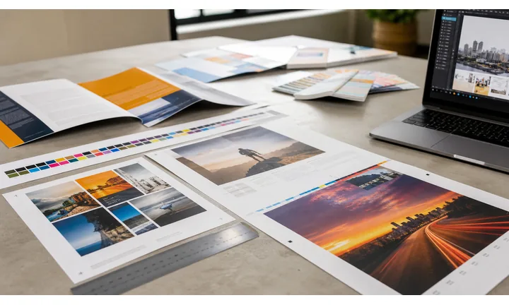
Turn a bare code into an obvious action
Use a Scan Me frame on posters, menus, labels, cards, stickers, packaging, signs, and handouts when the QR code needs a visible prompt before people decide to scan.
Scan me is a starting cue; the nearby CTA should name the result.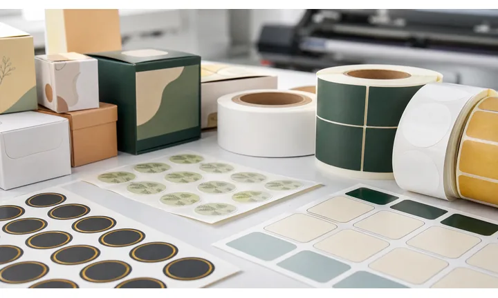
Pair the frame with destination-specific copy
A generic Scan Me label works better when the layout also says scan for menu, get the guide, save contact, claim the offer, register, open map, or get support.
The frame gets attention; the benefit earns the scan.
Keep the framed code readable at final size
Frames, colors, icons, and CTA text should sit outside the readable pattern and leave enough quiet zone, contrast, and physical size for the real placement.
Proof the frame after it is placed into the final artwork.A Scan Me frame should reduce hesitation, not hide the destination
The scanner should see both a clear invitation and a useful promise. Use the frame to make the code visible, then use the page, sign, label, or card copy to explain what happens next.
Use dynamic QR when the framed code will be printed widely and the destination may change.Visible prompt
Make the QR code easy to notice in a crowded layout without crowding the pattern.
Specific promise
Say what opens after the scan: menu, guide, form, offer, profile, booking, contact, file, or support.
Print-safe frame
Keep frame, CTA, logo, and background outside the quiet zone and test the finished size.
Editable destination
Use dynamic QR when printed framed codes may need a new URL, PDF, campaign, menu, or fallback later.
CTA frame design
Design the Scan Me frame so the code stays clear and the value is obvious
Frame designA Scan Me frame is useful when it creates attention, but it should not replace the real destination promise or weaken the QR pattern.
Use the frame to separate the code from the layout

Bare code
A plain QR code can disappear on a busy flyer, menu, package, poster, or card, especially when the surrounding design has many competing elements.

Framed CTA
A Scan Me frame gives the code a clear edge and a visible prompt while preserving the quiet zone around the readable pattern.
Keep the frame from becoming the whole message

Vague
Scan Me alone asks for action but does not explain whether the person will open a menu, coupon, profile, file, booking page, or support path.

Specific
Combine the frame with short nearby copy that names the benefit, then test the finished design at the intended print size.
Customize corners and modules

Standard pattern
A colored framed code already looks better, but it can still look like every other QR code.
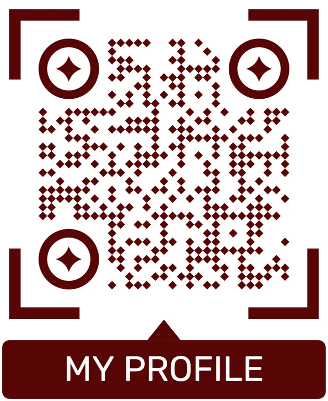
Custom eyes and module shape
Rounded modules, styled finder corners, and cleaner patterns can make the code feel premium. Keep the three corner markers clear.
Add a logo carefully
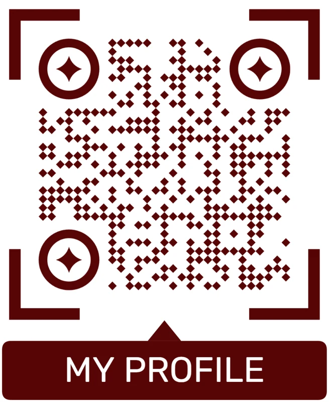
Styled QR code
A styled code can look polished, but people may still not know what brand, profile, file, or campaign it represents.
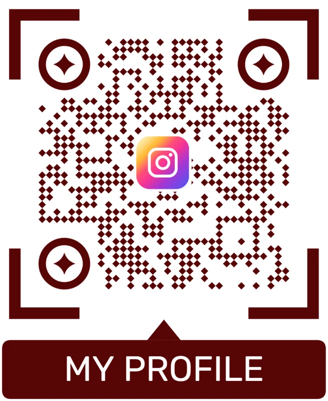
Logo QR code
A centered logo helps signal the destination. Keep it small, use a clean background behind it, and test the exported code.
The frame should make the scan easier to choose
A good Scan Me frame attracts attention, but the destination promise turns that attention into a useful scan.
Frame proofing
Proof the Scan Me frame at final size before publishing
Print readyFramed QR codes need the same proofing as the QR pattern itself: size, contrast, quiet zone, material, distance, lighting, and mobile destination all have to work together.
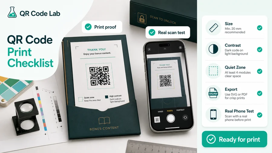
Check the frame does not squeeze the code
Print the framed QR at final size and scan it from the real viewing distance. If the frame makes the code too small, enlarge the whole asset rather than shrinking the QR pattern.
Keep the frame, CTA, logo, border, background, and surrounding copy away from the quiet zone so the phone reads the code quickly.
Test the finished placement, not only the QR preview
A Scan Me frame on a sticker, menu, poster, window, card, or package behaves differently after scaling, trimming, lamination, glare, and material texture.
Use SVG or PDF for professional layouts and check the destination on mobile before approving the file.
Make the destination repeat the promise near the frame
The first screen after scanning should confirm the action people expected from the framed code: menu, guide, offer, booking, file, profile, registration, or support.
If the destination may change after print, use dynamic QR so the same framed code can keep working without replacing the material.
Menu or table tent
Frame the code with a clear menu or order prompt and test under restaurant lighting.
Poster or flyer
Use a large enough framed code and CTA that can be understood before someone walks past.
Product label
Use a compact frame for setup, warranty, care, reorder, or support without crowding required label copy.
Business card
Use the frame for save contact, view portfolio, book, or open profile, then test the small printed size.
Approve the frame only when the physical scan and CTA agree
The finished asset should be visible, readable, and honest about what happens after scanning.
CTA placement
Place Scan Me frames where the prompt can lead to a real next step
PlacementA Scan Me frame works best when people can immediately understand why scanning is useful and have enough time, distance, and context to act.
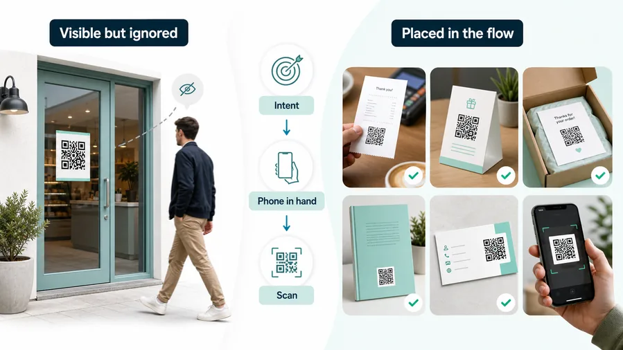
A visible frame cannot create intent by itself
A Scan Me frame can make a QR code noticeable, but it still fails when the placement gives no reason to scan.
Use the frame where the audience is already considering a next action, not as a decorative filler.
Put the framed code beside the promised benefit
Use the frame beside a menu, offer, guide, registration, product support path, portfolio, contact action, or event follow-up.
The stronger the nearby promise, the more useful the Scan Me cue becomes.
What does the scanner get?
Menu, coupon, guide, PDF, contact, profile, booking, registration, map, support, review, or product information.
Is Scan Me specific enough?
Add destination copy when the frame alone does not explain the benefit.
Can people scan from this position?
Check distance, angle, lighting, glare, motion, and whether the phone is naturally available.
Should placements be tracked separately?
Use different dynamic codes for posters, menus, labels, cards, windows, booths, and campaigns when reporting matters.
Poster or flyer
Use a framed CTA for event details, registration, offer, map, campaign page, or download.
Menu or table tent
Frame QR codes for menu, ordering, booking, specials, loyalty, Wi-Fi, or feedback.
Product packaging
Use framed prompts for setup, warranty, care, support, reorder, review, or bonus content.
Business card
Use the frame for save contact, view portfolio, book a call, or open profile.
Sticker or label
Keep the frame compact and test the surface, curve, glare, and quiet zone.
Event badge or sign
Open agenda, check-in, slides, map, community, survey, or follow-up resources.
Window or counter
Use framed prompts for hours, booking, menu, review, offer, contact, or directions.
Presentation slide
Use a bold frame and short promise so viewers understand the scan from a distance.
A Scan Me frame belongs where the value is immediately clear
Use placement and CTA copy together so the frame invites a scan that actually makes sense.
Prompt and print flow
Use Scan Me for simple prompts, and use specific wording when the destination needs context
A good frame protects the quiet zone, keeps the QR code large enough, and places the CTA where people notice it before scanning. Avoid squeezing the frame into the QR modules or placing text so close that the code loses clean whitespace. Strong contrast matters: a pale CTA on a busy background may look stylish but fail to invite action in real conditions.
Use Scan Me for broad, familiar placements where the destination is obvious from nearby text. Use a specific CTA for print materials where the benefit is not obvious: view menu, open directions, claim offer, download guide, upload photos, or book appointment. Specific wording is often more helpful because it answers the small question in the scanner’s mind: why should I scan this?
Test the framed QR at final size and from real distance. Dynamic QR codes can change the destination later, but the printed frame still promises a specific user experience. If the frame says menu, coupon, or booking, keep the destination aligned with that promise.