QR Code Design Generator for Branded, Scan-Friendly Styles
Design QR codes for packaging, posters, menus, business cards, stickers, and campaigns. Use strong contrast, clean frames, logo options, scan-safe sizing, and polished layouts for brands.
Free QR code generator
Create a QR code online
Generate QR codes for websites, email, phone numbers, vCards, Wi-Fi, plain text, forms, PDF files, and campaign links. Customize colors, add a logo or frame, then download a print-ready PNG or SVG.
Choose QR code type
Website QR code, Email QR code, Phone QR code, vCard QR code, Wi-Fi QR code, Text QR code, SMS, WhatsApp, event, and download links.
Add your content
Enter your website URL, contact details, message, phone number, location, or file destination before generating the QR code.
Customize and download
Adjust QR colors, error correction, logo, frame, size, and margin. Generate QR Code, Download PNG, Download SVG, or Save and track scans.
Scan-first design
Make the QR code look branded without making it harder to scan
QR design is useful when it helps people understand what they are scanning and why. A frame, brand color, logo, short call to action, and clean layout can make the code feel intentional instead of pasted onto the page at the last minute. That matters on packaging, menus, flyers, posters, business cards, event signs, product labels, social campaigns, and any printed touchpoint where trust and clarity affect whether people scan.
The design still has to respect the scanner. Keep strong contrast, preserve the quiet zone, avoid overly complex backgrounds, and test the final code on real phones. A beautiful QR code that only scans under perfect conditions is not a good design. Decoration should support the scan, not fight it. If the code becomes too dense, too low contrast, or too crowded by a logo, simplify it.
Use design controls where the QR code is part of the visual system. For high-volume print, combine good design with dynamic destinations and testing before production. The best result looks branded, explains the action, and scans quickly from the real placement.
Scan-safe QR design
Design QR codes that look branded without making the scan harder
Design intentA QR design page should help people choose logo, frame, color, CTA, size, and contrast in a way that supports trust and still works on real printed materials.
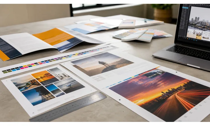
Make the code feel intentional in the layout
Use a frame, short scan prompt, and enough quiet space so the QR code looks like part of the design instead of a technical sticker dropped onto the page.
Good QR design tells people what they get after the scan.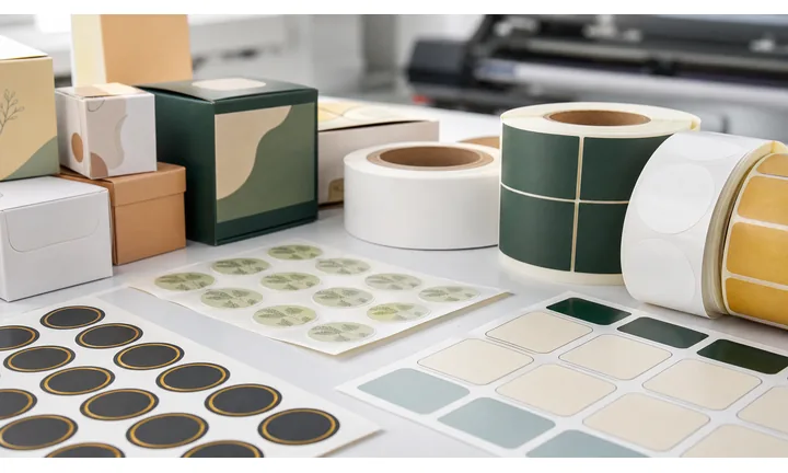
Protect readability before adding decoration
Brand colors, logos, rounded modules, and custom frames only help if finder corners stay clear, contrast remains strong, and the final printed size is easy to scan.
The phone reads the pattern before it notices the brand.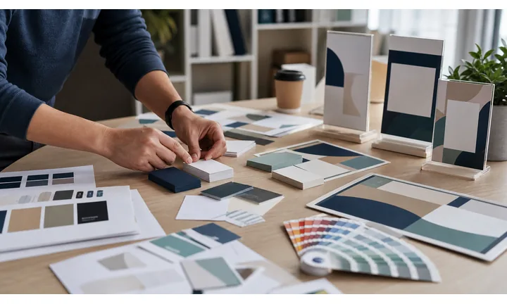
Match the design to the destination promise
A menu QR, portfolio QR, coupon QR, product guide, event QR, or booking QR should use CTA copy and styling that make the next action obvious before scanning.
Design is useful when it reduces hesitation.A designed QR code should earn the scan and still pass the phone test
The visitor is usually preparing something public: a flyer, label, poster, card, menu, package, sign, booth, handout, or digital graphic. The design has to communicate value while keeping the code reliable.
Use final-size testing before sending a designed QR code to print.Clear promise
Write the scan outcome near the code: view menu, save contact, claim offer, open guide, register, or get support.
Readable pattern
Preserve contrast, quiet zone, finder corners, and enough physical size for the scan distance.
Brand consistency
Use logo, color, frame, and CTA styling to match the campaign without overpowering the QR pattern.
Print confidence
Export the right file format and test the code on the actual material before distribution.
Branding without breaking scans
Style the QR code in layers: frame, color, logo, then proof
Design safelyQR styling works best when each design layer has a job: make the code noticeable, explain the scan, fit the brand, and preserve reliable phone readability.
Start with a frame and a clear scan prompt

Plain
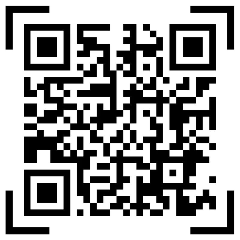
A plain QR code can scan correctly, but in a busy flyer, label, card, or poster it may not explain why someone should take out a phone.
Framed
A clean frame and short CTA turn the code into an obvious action while keeping the quiet zone protected and the scan area easy to recognize.
Add brand color only after contrast is safe
Risk
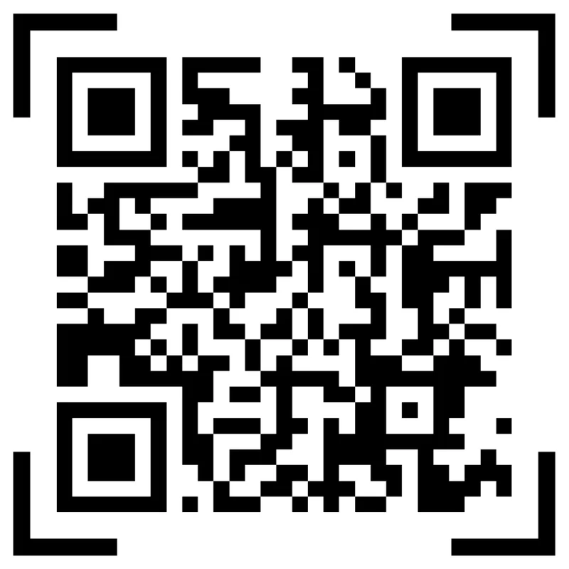
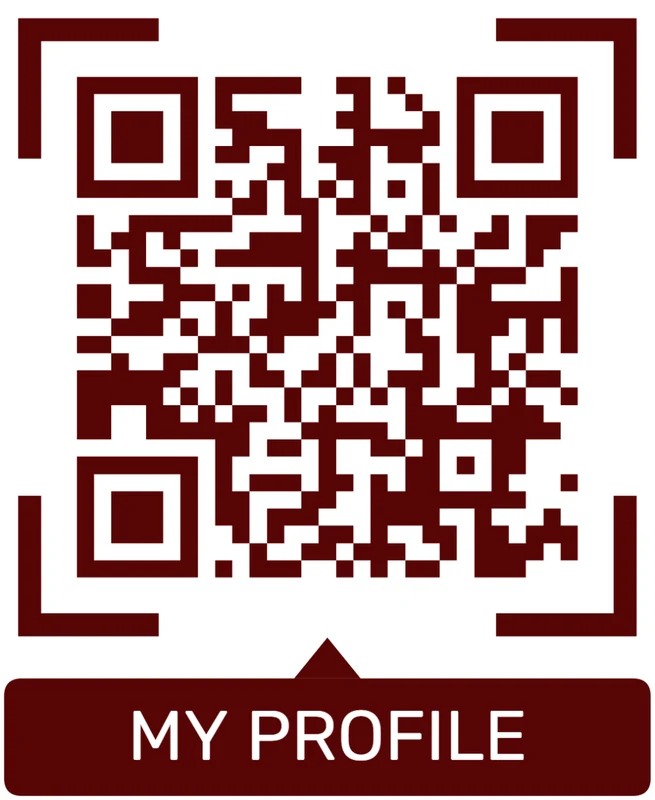
Low contrast colors, oversized logos, crowded backgrounds, and decorative patterns can make a QR look polished while quietly reducing scan reliability.
Proofed
Use brand color, logo, and shape choices where they do not hide finder corners, weaken the pattern, or make small printed versions harder to scan.
Customize corners and modules
Standard pattern
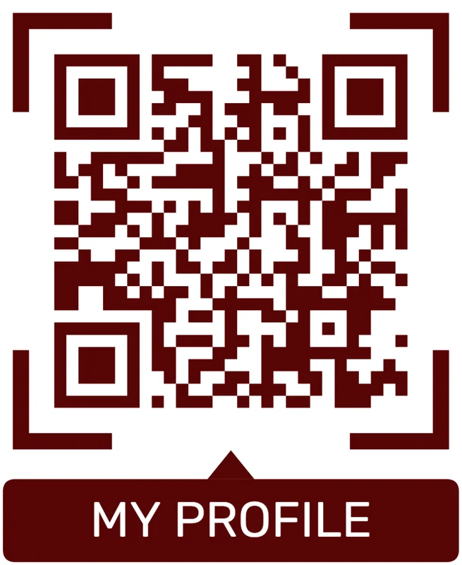
A colored framed code already looks better, but it can still look like every other QR code.
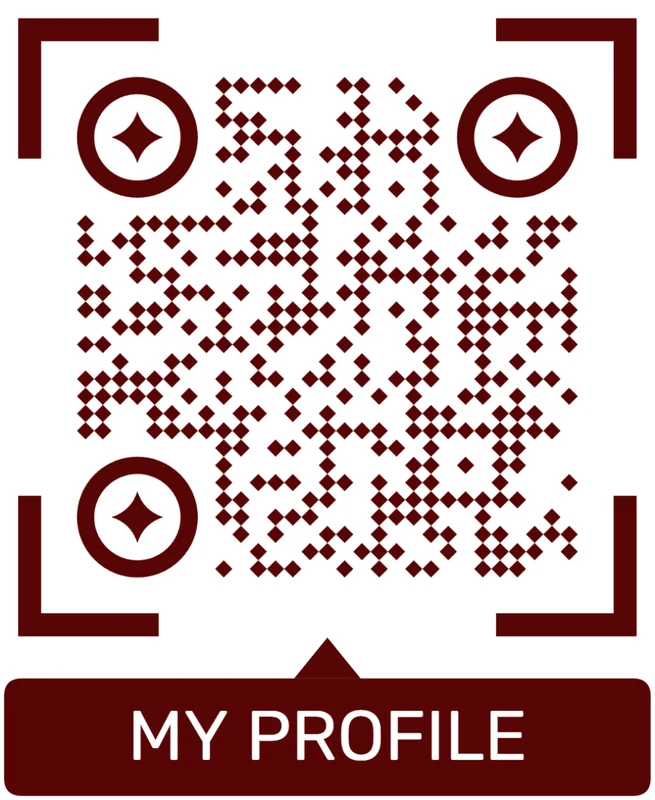
Custom eyes and module shape
Rounded modules, styled finder corners, and cleaner patterns can make the code feel premium. Keep the three corner markers clear.
Add a logo carefully
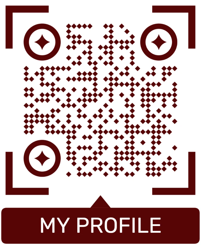
Styled QR code
A styled code can look polished, but people may still not know what brand, profile, file, or campaign it represents.
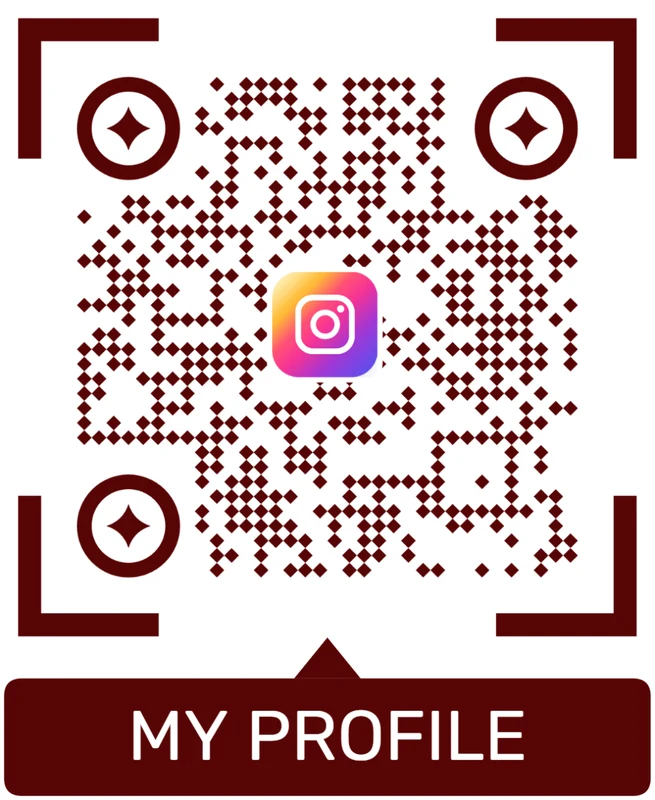
Logo QR code
A centered logo helps signal the destination. Keep it small, use a clean background behind it, and test the exported code.
Design should make the scan feel more trustworthy
A branded QR code succeeds when people understand the next action faster and the phone still reads the pattern without friction.
Design proofing
Proof the QR design before it becomes a printed problem
Print readyA styled QR code can change after export, scaling, paper choice, lamination, ink, lighting, or distance. Test the final design under the conditions scanners will actually use.
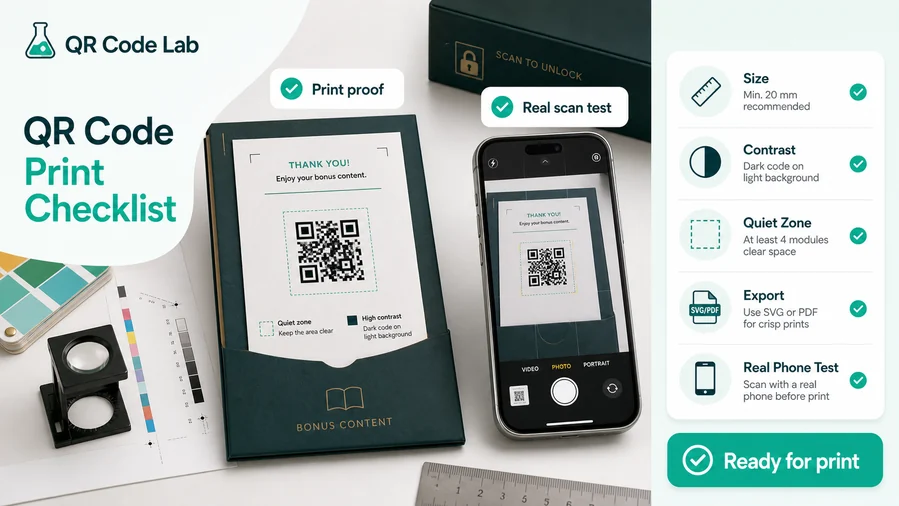
Check size, contrast, and quiet zone at final scale
Do not approve a QR design only from a large preview. Print it at the intended size, leave enough quiet zone, and scan it from the expected distance.
Glossy labels, textured stock, dark backgrounds, folds, windows, and small stickers can change how readable the code feels in the real placement.
Export artwork that keeps the pattern sharp
Use SVG or PDF for professional layouts when the QR code will appear on packaging, posters, cards, menus, labels, stickers, inserts, or signage.
Raster exports can work for small jobs, but they need enough resolution and should be tested after the design file is placed into the final artwork.
Make the page behind the design match the printed CTA
A beautiful QR frame cannot rescue a confusing destination. The first mobile screen should confirm the offer, menu, portfolio, guide, booking, contact, or file promised beside the code.
When the destination may change, use a dynamic QR code so the designed print stays usable without replacing the artwork.
Business card
Keep the code large enough to scan and use CTA copy that says save contact, book, view portfolio, or open profile.
Product label
Protect contrast on the package material and route buyers to setup, warranty, safety, or reorder content.
Poster or flyer
Match scan distance to code size and make the CTA visible before someone walks past the placement.
Menu or table tent
Test under restaurant lighting and make sure the first screen opens the menu or ordering action quickly.
Approve the design only after the scan path works
The finished QR asset should look branded, scan at the intended distance, and open the destination promised by the printed CTA.
Design scan UX
Make the designed QR code explain what happens after the scan
Scan UXVisual styling should reduce doubt. The code, frame, CTA, and landing page should work together so scanners know what they are opening and why it is worth the tap.
Use direct links when one action is enough
Menu, profile, guide, booking, couponA direct QR destination works when the printed CTA names one clear action and the page opens fast on mobile.
The design should support that promise with a short label such as scan for menu, view portfolio, save contact, or get the guide.
Use a landing page when the scan needs context
Buttons, files, images, contact, fallbackA microlanding page is useful when one scan should present several clean actions without crowding the printed design.
Keep the brand recognizable, lead with the promised action, and avoid making scanners hunt through a desktop page on a phone.
Use dynamic QR when the designed asset will live longer than the first URL
Print run, label, poster, event, packageDesigned QR codes often end up on physical materials that are expensive to replace.
Dynamic routing lets the same printed design keep working when offers, pages, files, forms, or campaign stages change.
Does the CTA name the scan result?
Use visible copy that tells people whether they will open a menu, file, profile, coupon, booking page, guide, form, or contact card.
Does the page confirm the same promise?
The first mobile screen should repeat the value shown beside the QR code and make the main action easy to tap.
Can the design survive real conditions?
Check glare, distance, contrast, background, paper stock, folds, and small sizes before approving the final design.
A designed QR code should make the scan feel safer and clearer
Use styling to improve trust and context while keeping the scanner experience fast, obvious, and reliable.
Design decisions
Treat decoration as a scanning risk until it proves itself
Start with a plain code that scans reliably, then add one design layer at a time: frame, brand color, corner style, pattern style, logo, and CTA. Test after each meaningful change. If the code becomes slower or less reliable, simplify the design. This approach keeps design creative but grounded in the practical job of helping a phone camera read the code.
The logo should clarify the destination or brand, not simply fill empty space. Frames and CTA labels are often more useful than decorative effects because they tell the visitor what action to take. “Scan for menu,” “Open portfolio,” “Watch setup,” or “Claim offer” can increase confidence before scanning. A stylish pattern with no clear promise may look good but still underperform.
For printed work, test the actual export, not just the preview. Paper, ink, gloss, size, and lighting can change everything. Dynamic QR codes can make the destination editable, but scan-friendly design still has to be proven before print. If a design feels risky, print one sample before sending the full batch.