QR Code Error Correction Guide for Logos, Print & Scans
Learn QR code error correction levels L, M, Q, and H for logos, labels, packaging, flyers, and damaged print. Choose safer settings without making codes too dense for mobile scans.
Free QR code generator
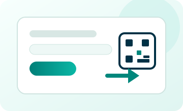
Create a QR code online
Generate QR codes for websites, email, phone numbers, vCards, Wi-Fi, plain text, forms, PDF files, and campaign links. Customize colors, add a logo or frame, then download a print-ready PNG or SVG.
Choose QR code type
Website QR code, Email QR code, Phone QR code, vCard QR code, Wi-Fi QR code, Text QR code, SMS, WhatsApp, event, and download links.
Add your content
Enter your website URL, contact details, message, phone number, location, or file destination before generating the QR code.
Customize and download
Adjust QR colors, error correction, logo, frame, size, and margin. Generate QR Code, Download PNG, Download SVG, or Save and track scans.
Scan reliability
Choose error correction for the way the QR code will be printed and used
QR code error correction helps a scanner recover the data even when part of the QR pattern is damaged, covered, dirty, distorted, or not perfectly printed. The common levels are L, M, Q, and H. Higher levels can tolerate more damage, but they also make the QR pattern denser because more backup information has to fit inside the code.
That trade-off is why error correction is not just a technical setting. It affects real design choices. If you add a logo, print on packaging, use small labels, place codes on products that may be scratched, or expect folds, glare, or wear, stronger correction can help. If you encode a lot of data into a tiny printed code, the pattern can become crowded and harder to scan.
For most branded and printed QR codes, choose error correction together with size, contrast, quiet zone, material, logo placement, and final phone testing. QR Code Lab can help create a cleaner design, but the final scan reliability depends on how the code lives in the real world. A beautiful QR code is not finished until it scans quickly from the distance people will actually use.
Readable QR design
Use error correction as protection, not permission to damage the code
Error correctionQR error correction helps a code survive small defects, logos, wear, printing, and camera conditions, but scan reliability still depends on contrast, size, quiet zone, and a clean pattern.
Add branding only while the code remains readable
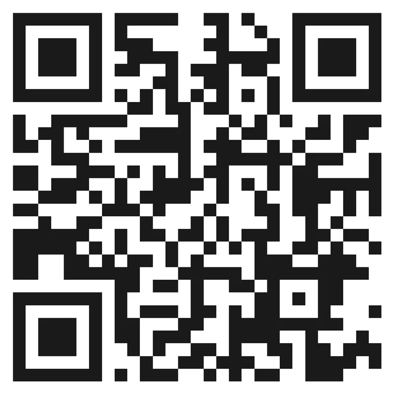
Risk
A large logo, low contrast color, busy background, or crowded frame can consume the tolerance that error correction was meant to provide.
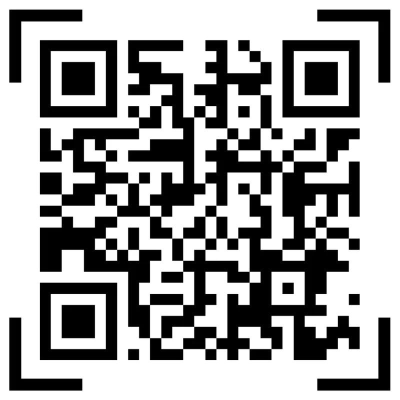
Better
Use error correction with a modest logo, strong contrast, protected finder corners, and enough quiet zone so the code still scans in real conditions.
Choose the correction level for the physical job
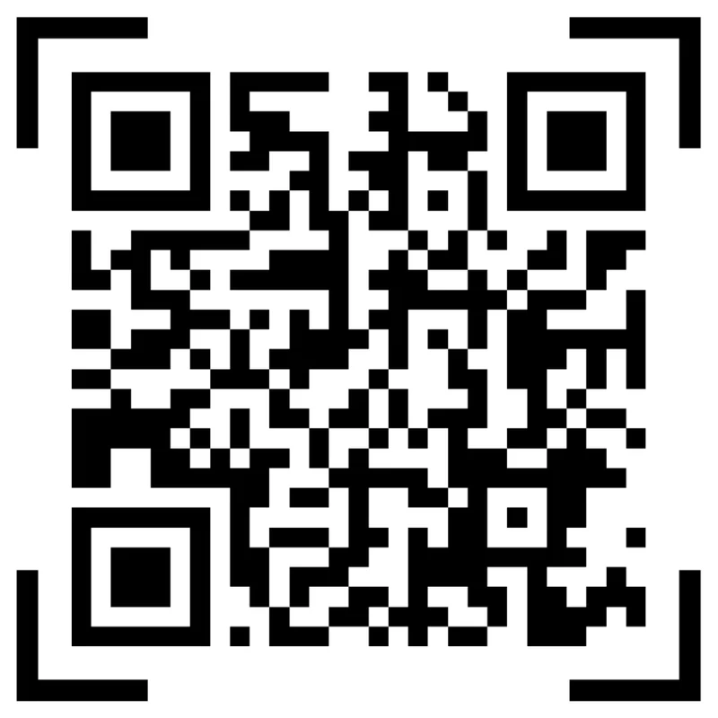
Underbuilt
A code that looks fine on screen may fail after resizing, ink spread, label curvature, scratches, lamination, or distance.
Prepared
Pick the level with the final material in mind, then test the actual printed size before approving the file.
Customize corners and modules
Standard pattern
A colored framed code already looks better, but it can still look like every other QR code.
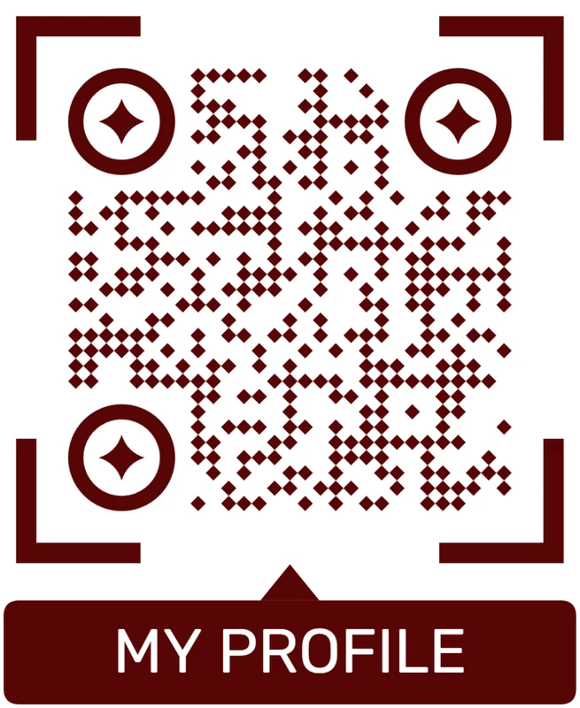
Custom eyes and module shape
Rounded modules, styled finder corners, and cleaner patterns can make the code feel premium. Keep the three corner markers clear.
Add a logo carefully
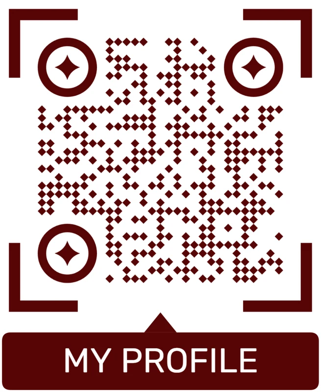
Styled QR code
A styled code can look polished, but people may still not know what brand, profile, file, or campaign it represents.
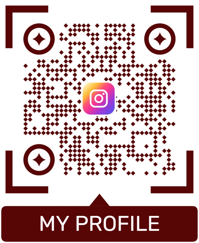
Logo QR code
A centered logo helps signal the destination. Keep it small, use a clean background behind it, and test the exported code.
Higher correction helps only when the design still respects scanning basics
Use level L, M, Q, or H based on the real risk: size, material, logo, damage, and viewing conditions.
Correction print check
Test error correction at the final printed size, not only in the design file
Print readyError correction decisions become real only after the QR code is exported, resized, printed, handled, and scanned from the distance people will actually use.
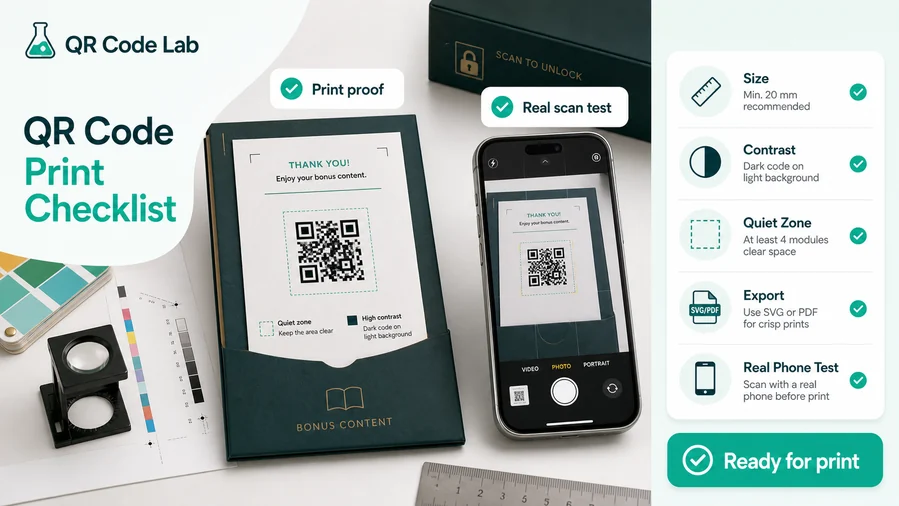
Match the level to the visual risk
Use lower levels for clean, high-contrast, undamaged codes and higher levels when logos, materials, wear, or imperfect scanning conditions add risk.
Remember that higher correction usually makes the QR pattern denser, so very small printed codes may still need more physical size.
Proof the exported artwork on real material
Print the code at final size and scan it from normal distance, lighting, and angle before sending files to production.
Check the actual destination after the scan, because a readable QR still fails the job if the page, file, or form is wrong.
Use more correction when the printed code carries design or damage risk
A plain black code on white paper may not need the highest level. A branded code on packaging, outdoor signage, labels, or handled material often benefits from extra tolerance.
The right answer is the one that scans reliably in the final context, not the one that looks best in a screenshot.
Logo QR codes
Use extra tolerance only with a modest logo, clear corners, strong contrast, and real scan testing.
Packaging and labels
Plan for curvature, gloss, scuffs, folds, small sizes, and production variation.
Posters and signs
Balance correction level with physical size so dense patterns remain readable from distance.
Documents and cards
Keep codes crisp in PDF/SVG export and avoid shrinking them after approval.
Approve correction level after scan testing, not by theory alone
Choose the level that survives the real artwork, material, size, and destination workflow.
Scan reliability
Make error correction support the whole scan experience
Scan UXA correction level can recover damaged modules, but it cannot fix a confusing CTA, a broken URL, a slow page, poor placement, or a code that is too small for the distance.
Use basic correction when the code is simple and protected
Clean URL, plain design, indoor printA clean high-contrast QR with enough size and quiet zone may not need maximum correction.
Keep the pattern simple when the printed area is small or the scan distance is close.
Use higher correction when design removes safe margin
Logo, frame, brand color, custom styleLogos, colors, and decorative styling can make a QR more recognizable but also consume recovery capacity.
Use stronger correction only with testing and keep the scan area visually obvious.
Use correction for materials that may degrade
Packaging, labels, outdoor signs, handled cardsScratches, glare, folds, dirt, lamination, curvature, and ink spread can all create scan failures.
Match correction, size, and placement to the physical risk instead of relying on one setting.
Does the code scan at final size?
Test the actual exported artwork, printed size, distance, and material before launch.
Are the quiet zone and finder corners protected?
Do not let logos, frames, photos, cut lines, or background graphics crowd the parts scanners need first.
Does the destination still match the print?
A readable code is not enough; the page, file, form, or offer must match the promise beside the QR.
Reliability comes from the whole system
Correction level, visual design, physical placement, and destination quality all have to agree.
Logo and print trade-off
Use stronger correction when design or physical wear adds risk
A logo placed in the center of a QR code hides part of the pattern. Error correction gives the scanner room to recover, but it is not unlimited. Keep the logo modest, protect the quiet zone, use strong contrast, and avoid adding so much decoration that the scanner has to fight the design. The goal is a branded code that still feels instant to scan.
Use higher correction when the code will be printed small, handled often, placed on packaging, exposed to dirt, folded in a booklet, or combined with a logo. Use vector exports such as SVG or PDF when possible, especially for labels, packaging, posters, books, cards, and product inserts. A clean file is safer than resizing a soft raster image inside a design tool.
Then test a printed sample with more than one phone. Error correction helps with damage and small imperfections, but it should not be used to excuse weak contrast, glossy glare, tiny codes, missing margins, or a confusing destination after the scan.
Error correction FAQ
Common questions about QR error correction
Quick answersUse these answers to choose a correction level without treating it as a substitute for scan-safe design.
Correction levels
The level controls how much damage the QR code can recover from.
What are QR error correction levels?
Levels L, M, Q, and H reserve different amounts of the code for recovery so scanners can still read the QR when part of it is imperfect.
Does higher always mean better?
No. Higher correction can make the pattern denser, so tiny codes may still scan worse if the physical size is too small.
Which level should I start with?
Use a normal level for clean codes and increase it when logos, print wear, low quality material, or outdoor placement add risk.
Can correction fix a bad URL?
No. Error correction helps read the QR pattern; it does not repair wrong destinations, broken pages, or confusing scan copy.
Using logos safely
Branding should leave the important scan structure intact.
Do logo QR codes need higher correction?
Often yes, because a logo covers part of the pattern, but the logo still has to stay modest and avoid finder corners.
Can I cover the center with any image?
Keep the logo small, simple, and tested. A large or complex image can overwhelm the recovery capacity.
Should I use brand colors?
Use brand colors only when contrast remains strong on the final material, not only on a bright screen.
What matters more than the level?
Contrast, quiet zone, size, clear corners, and real scan testing usually matter more than choosing the highest level.
Printed materials
Print introduces risks that do not appear in a screen preview.
Why did my QR scan on screen but fail in print?
Print size, paper, gloss, ink spread, lighting, folds, and viewing distance can all change readability.
Should posters use higher correction?
Posters need enough physical size for distance first. Higher correction helps damage, but it does not replace proper sizing.
What about labels and packaging?
Curved, glossy, small, or handled labels often need conservative design, stronger contrast, and real material testing.
Is SVG or PDF better for print?
Vector export is safer for professional layouts because it keeps QR edges sharp when scaled correctly.
Scan checks
The right level is the one that works in the real context.
How should I test error correction?
Print the final artwork at real size and scan it with normal phones from the expected distance and lighting.
How many phones should I test?
Use several common phones or scanner apps when the QR will be public, branded, small, or printed in volume.
Should I test after resizing?
Yes. Resizing after approval can make dense QR patterns harder to scan, especially at high correction levels.
What if one phone scans and another does not?
Treat that as a warning. Increase size, improve contrast, simplify styling, or adjust placement before production.
Visual decisions
Correction supports design choices but does not remove scan constraints.
Can I invert QR colors?
Avoid inverted or low-contrast color schemes unless they pass real-device testing on the final material.
Can I place QR over a photo?
Use a clean background or frame. Busy photography can break contrast and quiet zone even with high correction.
Do frames affect correction?
Frames are fine when they do not crowd the quiet zone or make the scan area ambiguous.
Can decorative dots reduce reliability?
Yes. Custom shapes can make modules harder to read, so test them more carefully and keep contrast strong.
Destination control
Correction and dynamic QR solve different problems.
Does dynamic QR improve error correction?
No. Dynamic QR makes the destination editable and measurable; error correction affects pattern readability.
Why use dynamic with print?
Use dynamic when the printed code may need a new URL, file, menu, campaign, or support page later.
Can analytics show scan failures?
Analytics record successful scans that reach the managed link, not every failed camera attempt.
Should public print use dynamic QR?
Often yes when the destination may change or reporting by placement matters after launch.
Common failures
Most scan failures come from a mix of factors.
Why does the QR scan slowly?
It may be too small, too dense, low contrast, crowded, damaged, far away, or placed under poor lighting.
What should I fix first?
Increase physical size, improve contrast, protect quiet zone, simplify styling, and retest the final print.
Can I repair printed codes later?
You cannot change the printed pattern. Dynamic QR can change destination, but readability problems require reprint or relabeling.
When should I use level H?
Use H when branding, logos, wear, or material risk justify it and the code remains large enough to scan easily.
Before launch
Approve the QR as a working physical experience.
What should be checked before print approval?
Check level, size, quiet zone, contrast, export format, final destination, CTA, and real scan behavior.
Who should own the decision?
Design, marketing, product, or operations should agree on both artwork and destination before production.
What should the CTA say?
Name the benefit clearly: scan for manual, watch demo, open menu, register warranty, or get tickets.
What is the safest final rule?
If the QR must work in public or at scale, test the exact final artifact before distributing it.
Error correction is only one part of QR quality
Use it with good sizing, clean design, tested print, and a destination that matches the scan promise.